hacking .gov shortened links
This past Friday, the web portal to the US Federal government, USA.gov, organized hackathons across the US for programmers and data scientists to work with and analyze the data from their link-shortening service. It turns out that if you shorten a web link with bit.ly, the shortened link looks like 1.usa.gov/V6NpL (that one goes to a NASA page). And because this service was paid for by taxpayer money, the data about each clickthrough is freely available.
Shortened-link click-through data is interesting. It tells you the time and approximate geographic location of each click-through, and the web page or service that the link was on (assuming someone didn’t type the URL in by hand). You also know when the shortened link was created, which tells you a little bit about the way links are shared. Bit.ly themselves have several full time data scientists on staff whose job is to learn about what shortened-link data can say about web traffic patterns and link sharing, potentially very lucrative information.
For my part, I just wanted to do some fun visualizations. Along with friends in NYC, I joined the hackathon remotely, following along on twitter and listening to dance music in their turntable.fm room. I managed to get rough drafts of two somewhat non-trivial graphs done during the official hackathon, and I re-built them with larger and more random data later.
This first graph looks at the difference in time between when a link was created (the first time someone tried to shorten the target URL) and when the clickthroughs happened. For each of the 25 most frequently visited target domains (mostly US government agencies), I built a density plot, or smoothed histogram, of the timings.
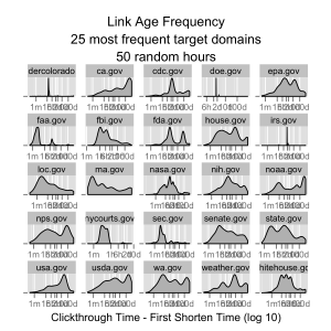
There are some interesting differences. Links from senate.gov are mostly clicked through within a few hours of their creation, and links from the NY Courts are clicked through in less than an hour. There appear to be links to NOAA and the State of California pages that are frequently clicked through hundreds of days after their creation. It would be interesting to dive into the content of the target pages, categorize them, and learn what causes these differences.
Speaking of diving into the content, I did a very simple version of that next. When clicking a link to a government web page, are people looking for information about their hometown? Fortunately, clickthrough data includes geocode information for the clicker’s IP address, which includes the nearest city. I decided to find out by scraping the text content of the 100 most frequently accessed web pages, and detected whether or not each city was in each web page.
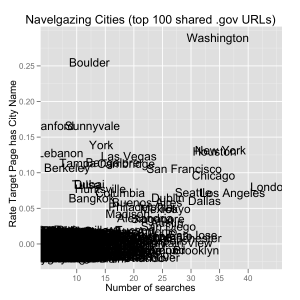
This “navel-gazers” plot shows the summarized results. For each city in the data set with more than 5 clickthroughs, I plotted the raw number of clickthroughs from that city (the X axis) against the proportion of clickthroughs that ended up on a web page with the name of the city in it (the Y axis). Many cities are clustered in the lower-left, with few clicks and no instances of their city on the target page. Large cities like New York and London are far to the right, as expected from their population, and they show up in target web pages occasionally. Washington (DC) is both a frequent clicker of shortened links, as well as a city that tends to show up on web pages, unsurprising given that it is the seat of the Federal government. The exceptions are the most interesting. People in Bangalore clicked through more than 15 times in this sample, and about 12% of their clicks were to pages with the name of their city. In Boulder, a quarter of the 12 or so clicks mentioned their town!
Deeper analysis would be needed to explain these results, but they were fun to put together! For those interested in checking out my work, including R code to pull a sample of 1.usa.gov data from the archives, please check out my repository on GitHub: https://github.com/HarlanH/hackathon-1usagov